UPS

UPS

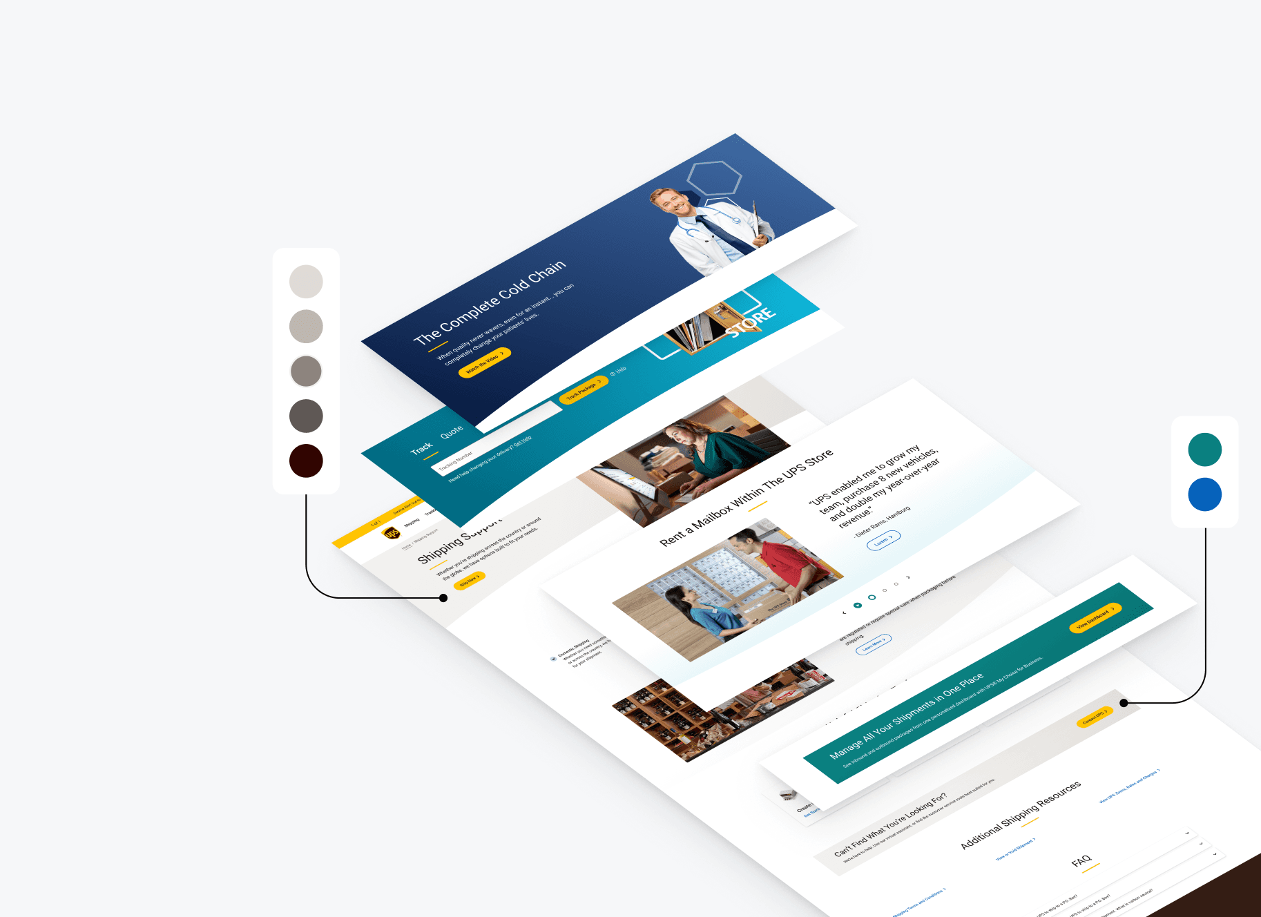
Rebuild of the entire design system

MY ROLE

UI/UX Designer

TOOLS

Figma

TIMELINE

February 2023 - December 2023

CHALLENGE

While i joined the team in the mid of a revamp, i was able to take on creating guidelines for foundations, writing documentation for and helping design components. As an agency, we worked as a team of 3 (myself as the Design Lead, another designer, and a UX writer), collaborating with the internal UPS team on a daily basis.


The goal of the project was to create a cohesive design foundation that improved team efficiency, product consistency, and long-term maintainability across our platform.

RESULTS

  • UPS.com has been recognized as a Webby Honoree for Best User Experience

Not interested in my design process? No worries at all.

Highlights

A simplified flow that results in faster claims submission

• Shortened from 7 pages to 3-4 pages (depending on the flow)

• Added progress indicator and improved navigation

• Enhanced photo upload to allow images greater than 1MB

• Created ability to file claims on UPS.com as a DAP customer

CONTEXT

If we implement quick wins to the claims process by simplifying screens, clarifying navigation, and humanizing language, we can improve completion rates and satisfaction.

The problem

Long forms, low conversion

Business

  • The claims submission process is complex by design 

  • “Resolve a Claim” is UPS’s lowest scoring journey; our cNPS (16) lags FedEx (24) and Amazon (38). 

  • Of the 1.2M users who began the claims process on UPS.com in Q1 2021, only 25% completed it. This number increased to approximately 37% in June 2021 after one screen was removed from the process. 

User Experience

  • Painful user experience (57 steps on average for damage flow, ~15 minutes to complete) 

  • 70% of claims submitted are rejected 

  • Unclear communication to the user throughout the flow (errors, modals, submission confirmation) 

  • Long processing time and unclear requirements post-submission 

Layout

Long forms, low conversion

Priority 1 - Remove Unnecessary Friction 

  • Remove unnecessary steps 

  • Move dead-end yes/no steps up earlier in the process (e.g. available for inspection) 

  • Unclear communication to the user throughout the flow (errors, modals, submission confirmation) 

  • Streamline what’s presented to user based on what we know (e.g. # of packages received should only appear for multi-piece shipments) 

  • Pre-populate wherever possible 

Example: Shipper Damage Flow

Priority 2 - Add Progress Bar 

  • Keep user oriented within the flow  

  • Ensure each section is balanced (post the removal and restructuring of steps) 

Progress Bar Explorations

Additional Priorities

  • Add a calculator in package contents section so the user can easily see reimbursement breakdown 

  • Add an outline of claims process early on so the user knows what to expect 

  • Fix hierarchy to reduce cognitive load 

Global UI is a placeholder

The UPS design library was getting a major overhaul, and while we were working on Claims, another team was finalizing a big bulk of UI elements. So with that in mind, we had to come up with a layout that kept global UI as a placeholder.

The following 4.0 Design elements have not been retroactively updated to the comps upon approval. Please keep in mind that all UI elements shown in this presentation are placeholder. 

  • Input fields (inline validation, error states)

  • Radio buttons

  • Checkboxes

  • Text links

  • Text boxes

  • Dropdown menus

  • Iconography

  • Modals

  • Tool tips 

Visual designs

Shipper damage flow: Before

Shipper damage flow: After

Final designs

Simple flow & clean design

RETRospectIve

Takeaway learnings

This section is Work In Progress