Full redesign of a real estate investment platform
MY ROLE
Founding Product Designer
TOOLS
Figma
Maze
Notion
Jira
Principle
TIMELINE
September 2020- February 2023
CHALLENGE
As a sole designer, I led the entire design process from conception to completion, suggesting what design activities should be completed to advocate for users' voices.
RESULTS
Throughout this 2 year journey we were able to launch multiple well built platforms in a few languages, grow the team from 5 to about 45 people, become number 1 real estate investment platform in the MENA region, and be featured in publications like:
Not interested in my design process? No worries at all.
Highlights
A simplified flow that results in faster claims submission
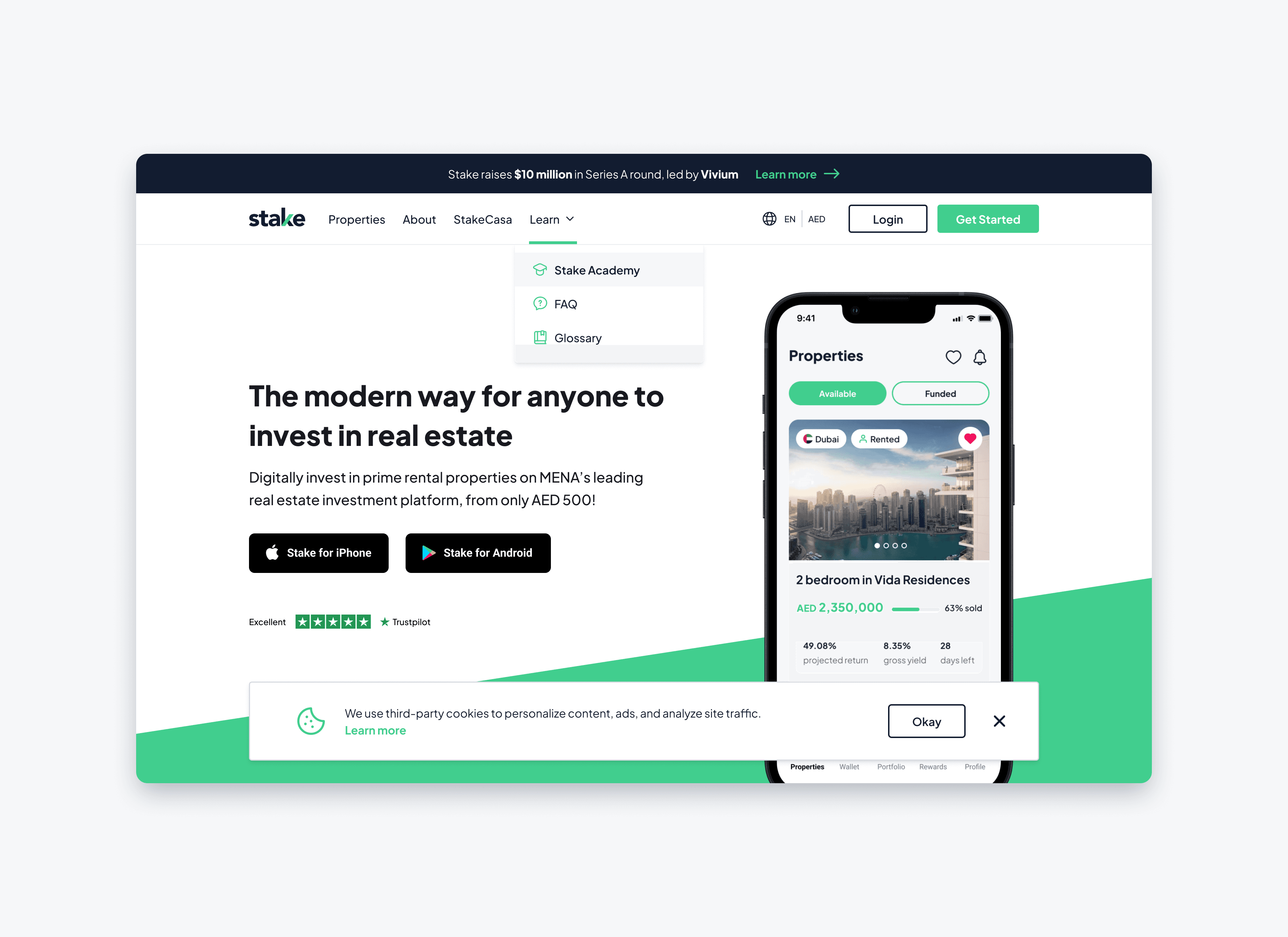
As a brand new company, we've gone through many variations of branding and styling for our website and marketing collateral. Working with one of the Dubai-based agency, Ducklife, we crafted our first Branding Guidelines and started re-building the website & mobile app page by page. Utilizing UI/UX best practices, conducting user interviews and adopting a mobile-first approach, we've rebuilt the core pages of our app with inner pages to be completed soon. Translating the newly redesigned pages to the web version, we focused on bridging the gap between Web and App platforms.
CONTEXT
A complete overhaul was due
By the time I joined, the company was 8 months young and the team was only 5 people. Long time loading pages, unappealing designs, no context and 0 user consideration - all of this had to go.

The problem
Long forms, low conversion
Business
Low conversion from user to customer
Limited customer feedback channels
Long property funding timelines (up to 2 months) – lack of user trust
User Experience
Outdated design
No app (the most requested feature at that time), lack of social media presence
Long and tedious sign up process
Long page loads
No design consistency across channels
Layout
Prioritizing user experience
Stake Site Map
Remove unnecessary pages
Simplify navigation
Add new key pages
Translate & optimize the site architecture for Arabic

Stake Information Architecture
Add new sections on pages
Rethink information hierarchy on each page

Visual designs
Building a design system
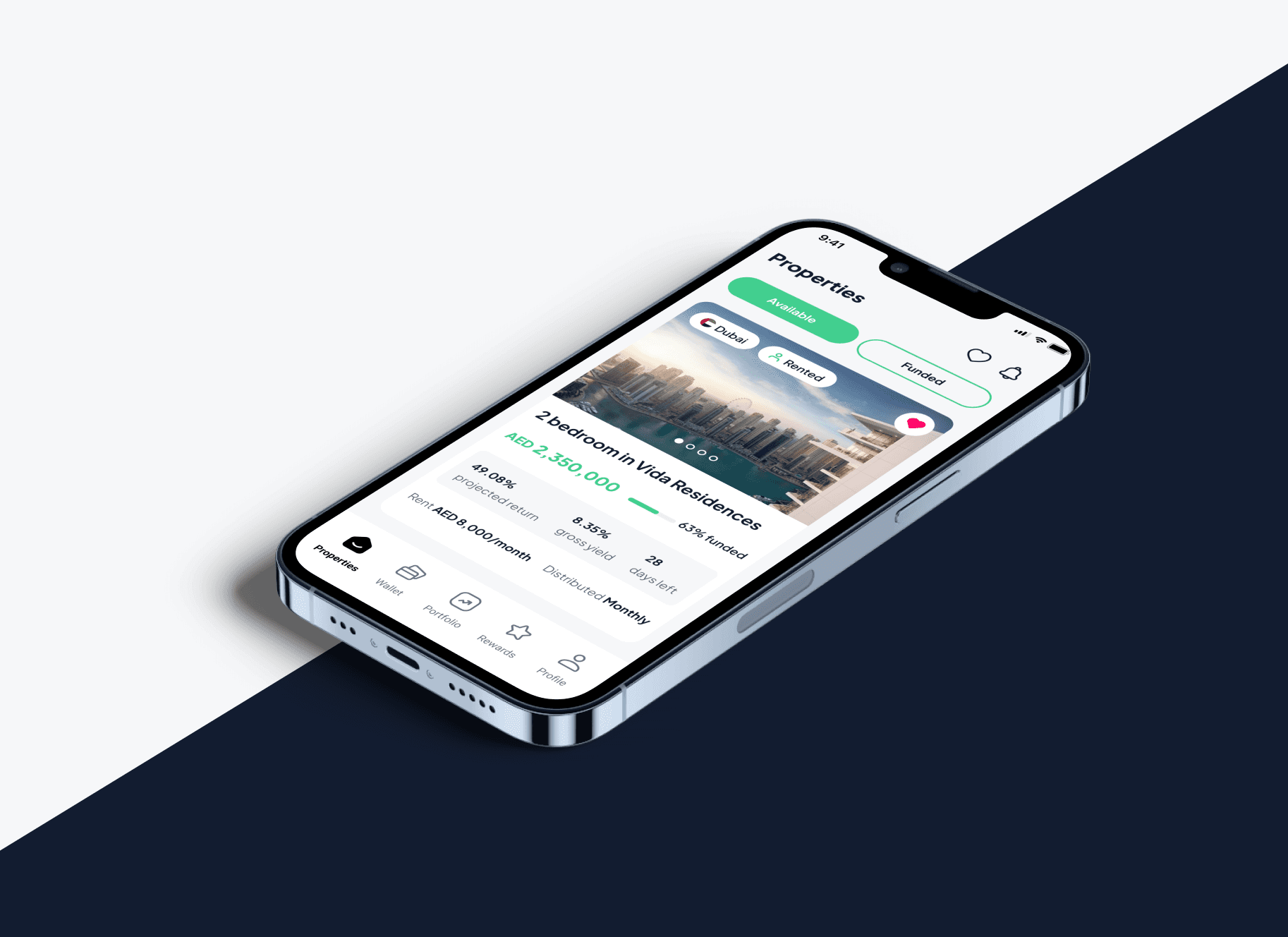
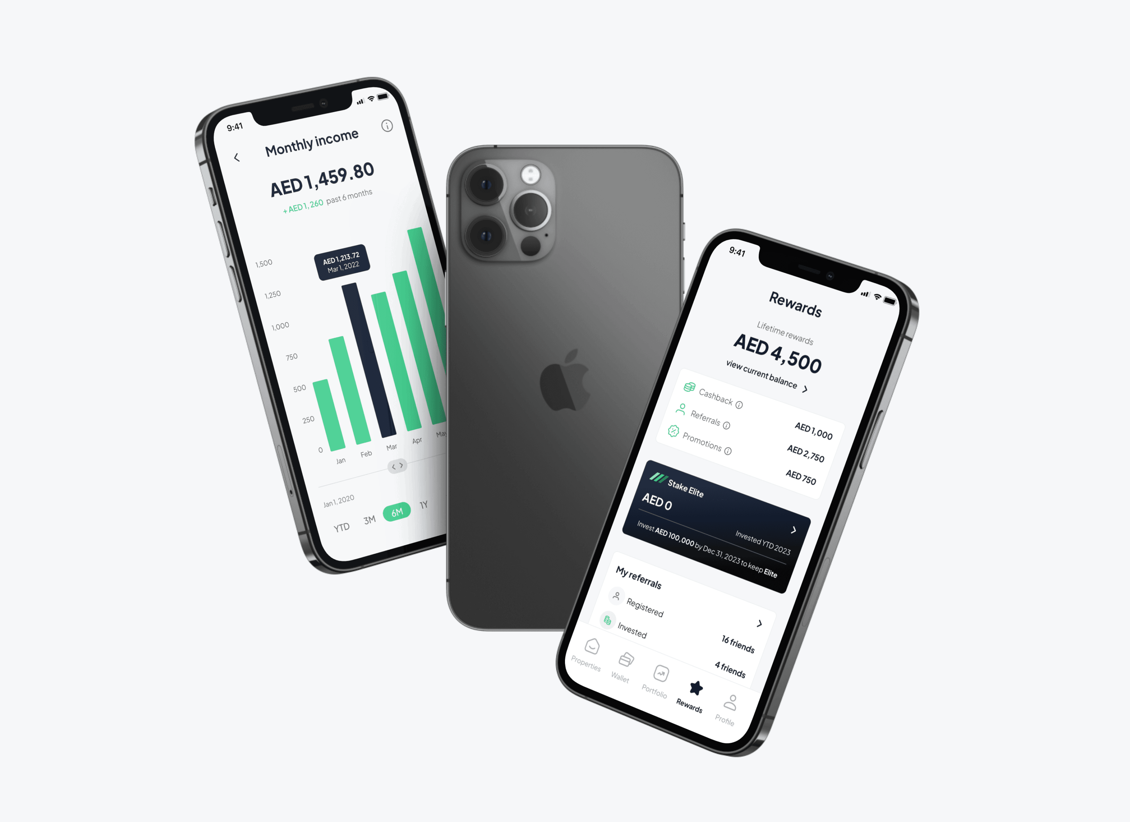
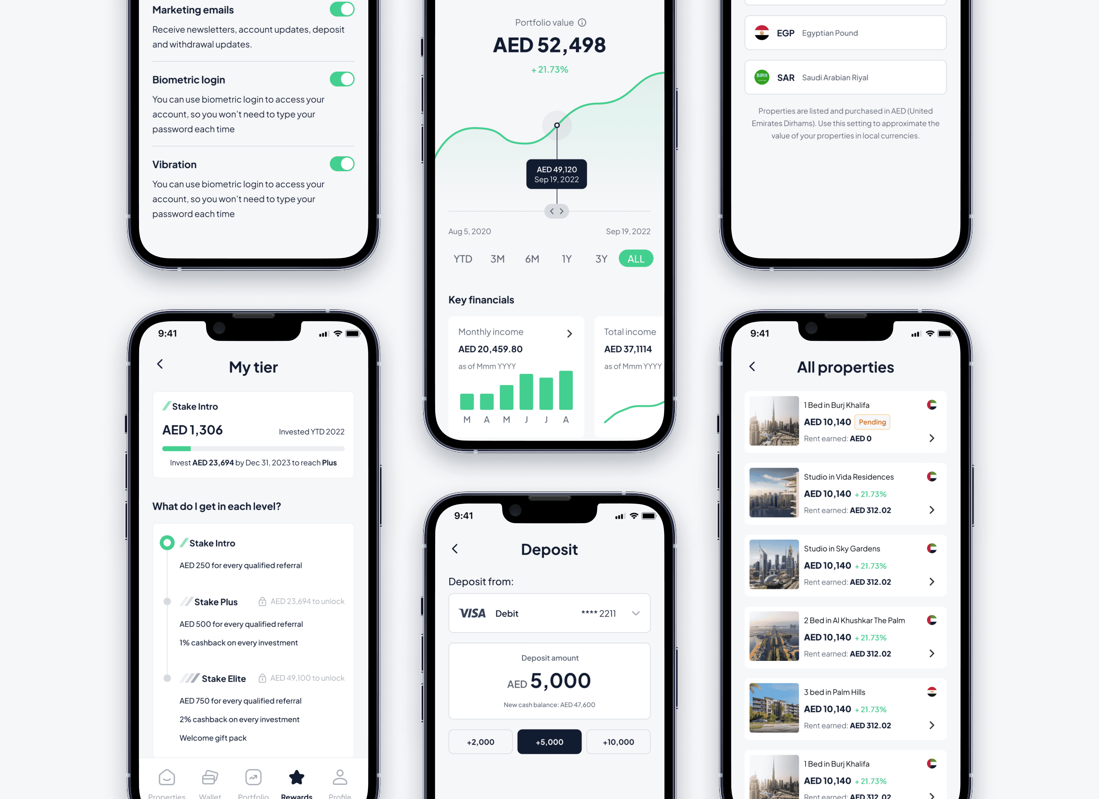
Since Stake was an early-stage startup and the entire website needed to be redesigned anyway, the design system needed to be built from scratch. That helped bring a lot of consistency across all our channels and lay a solid foundation to expanding the branding guidelines. Here are some of the key pages I worked on:
Foundations:
Typography
Colours
Shadows
Logo
Grids
Spacing
Components:
Buttons
Icons
Avatar
Badges
Feedback Banners
Overlays
Input Fields
Cards
Tabs
Navigation

Final designs
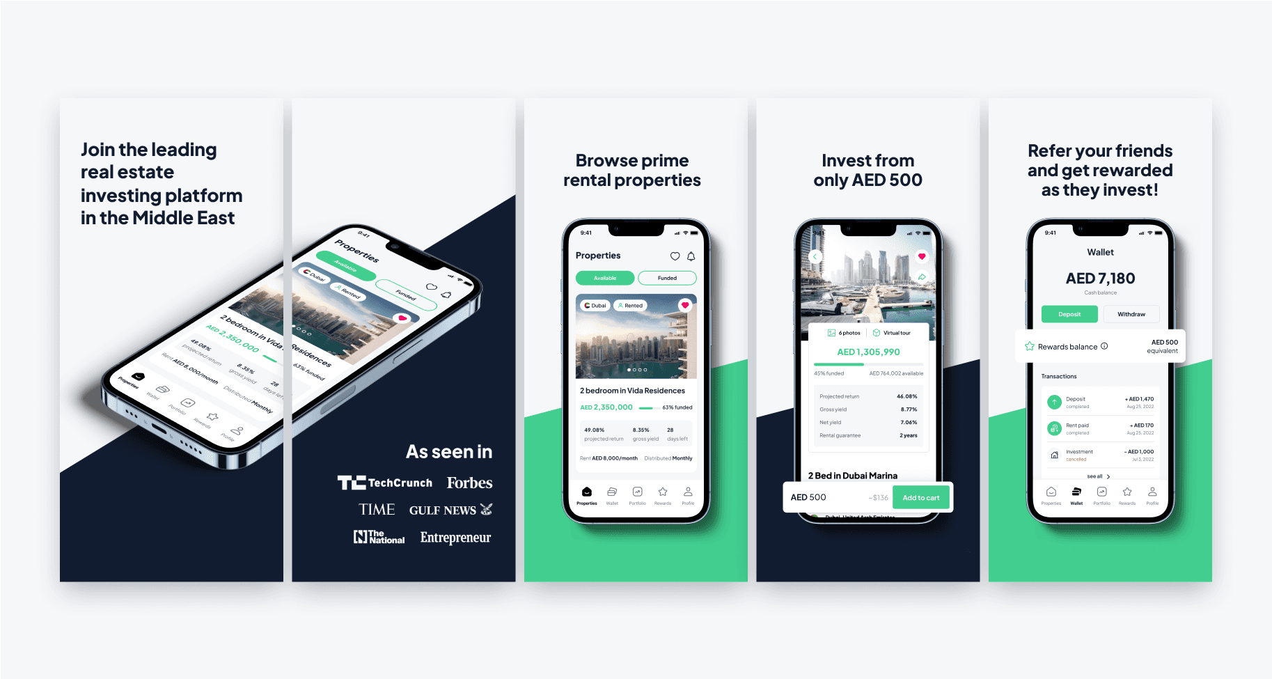
App Store images
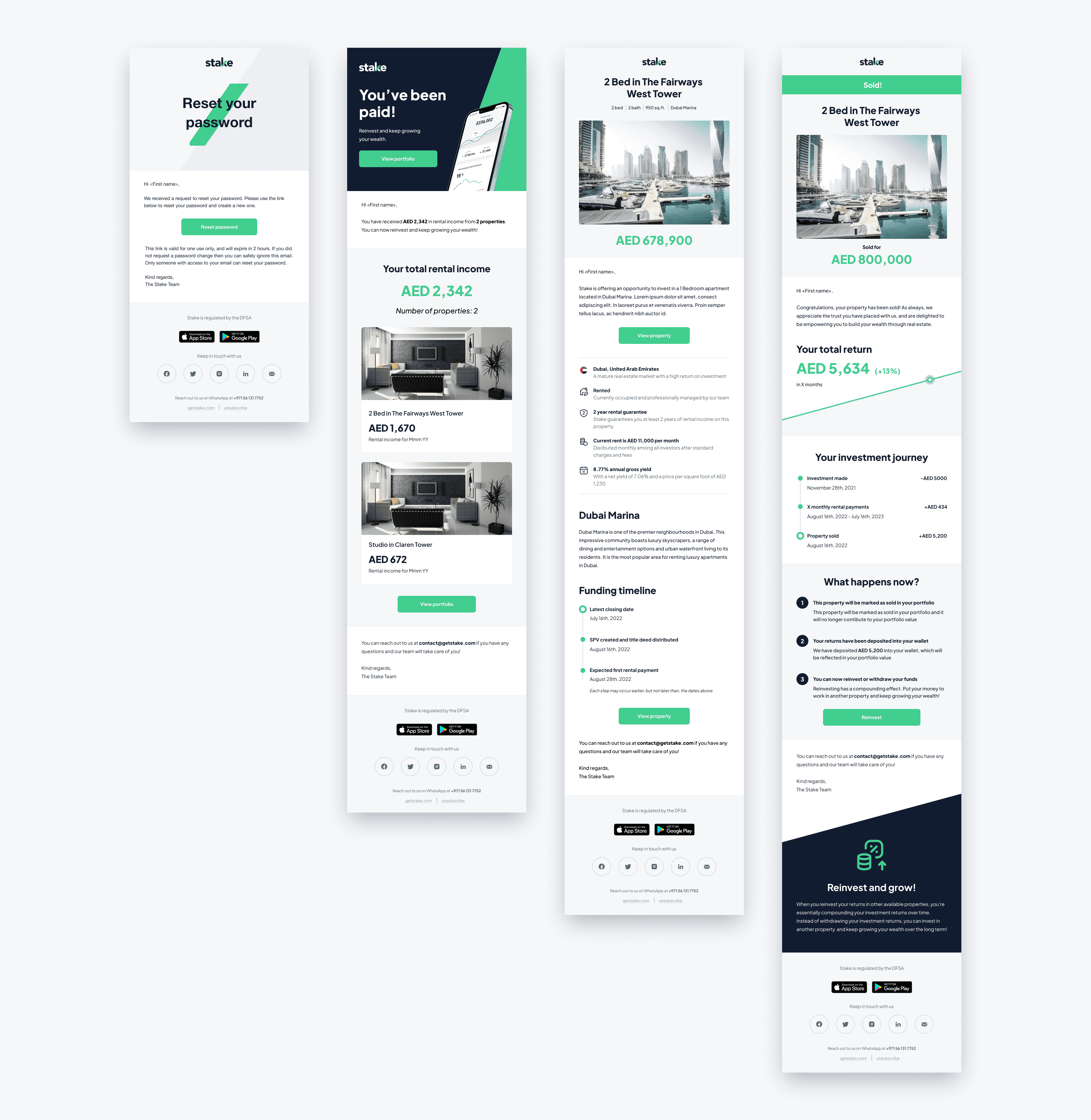
Transactional emails
RETRospectIve
Takeaway learnings
This section is Work In Progress